After my experiments with ArchViz in the Unreal Engine, my skills were called into play to help solve a real-world issue. I use the word issue lightly here because it’s not a matter of life and death, but a more trivial problem around deciding what colour to paint my kitchen.
I have experience of painting rooms and in the past have attempted bold and subtle colour choices with mixed success. The biggest issue I faced in the past (and again today) is that I have only painted walls of rooms in modern houses. This should be less of an issue right? Nice clean, smooth surfaces should be a breeze. But it isn’t. It isn’t because compared to houses built pre 1950’s, the amount of light that enters a room is minimal as a result of building regulations dictating that windows be as small as possible to provide more efficient insulation. I estimate the standard living room of a house built today has about 30 – 40% less natural light entering it than the equivalent living room in a house built between 1920 – 1950.
I bring this up because this lack of natural light is impacted when you paint colour onto the wall. The obvious effect is that any colour darker than pure white will dramatically affect the overall perceived brightness of the room. This is fine if you want a cosy room that feels smaller than it is. Not great if you are trying to maintain the sense of the openness that the physical space provides.
When I attempted to recreate my living room space as an introduction to the Unreal Engine for ArchViz during the summer of last year, I quickly realised the proposed choice of wallpaper was simply too dark. In the end the wallpaper idea was scrapped altogether. I was glad I saw the results (with relatively realistic lighting simulated):

Although not completely realistic in terms of lighting (there wasn’t enough reflected light cast & captured), the scene did demonstrate that the wallpaper would have made the room feel much too cosy and claustrophobic. I didn’t want to make the mistake of painting the kitchen in a colour which would repeat the lessons learned from the living room experiment.
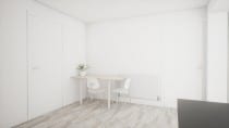
The current kitchen is painted white (as is the rest of the house – hence why some colour would be particularly welcome). It has the most amount of incoming natural light in the entire house due to the patio doors and ‘lightbox’ windows:

Despite this, it was still important to check how ‘dark’ the paint colour could go before it started to make the space “shrink”. I started exploring the Dulux website for colour inspirations and decided it should either be a shade of olive, green or teal:

After some trial the clear winner was a muted green called Morning Meadow:

When that was applied to the walls, the kitchen felt very different but, importantly, still felt like an open space:

The reason a green was selected over a blue/teal shade was that it complemented the floor and kitchen units better:

The whole scene was created from primitive models with only basic UVW mapping. I also reused assets I created in the Living Room and Office scenes I created in Unreal. The most complex original scene assets were the cupboard/drawer handle and the floor material. The problem with the floor texture is that due to its repetitive nature, you can never capture enough of the texture that doesn’t have light interaction and free from perspective distortion. Also I needed high fidelity because of how prominent it is in the scene. To create it I took photos of each individual ‘strip’ and composited them together in Photoshop.
Even though this scene’s job is done, I am going to continue working on it in my spare time and just add little details here and there until it is a complete recreation of my kitchen.