After being hugely impressed with Adobe’s LIVE channel, I recently participated on their 3 day UX series of workshops where the latest features of Adobe XD were presented live by professional designers, I was inspired to enter their competition where participants were set the brief of creating a mobile app concept along the theme of holiday planning. Entries had to consist of at least 3 screen designs and be linked up using the prototype tools in XD.
Although ‘holidays’ could mean Christmas, my interpretation of brief yielded a concept that would help you plan a summer/winter break (or vacation if you’re of American persuasion).
Unfortunately it came during one of the busiest periods for me but I was still able to assign a few hours to my response.
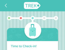
Introducing TREK, your personal holiday organiser:

The idea behind the concept is that the user connects the app to the various services (such as flight tickets, boarding pass, accommodation reservations, etc. and TREK will remind the user when certain actions need carrying out and provide a simple check list to check on progress. TREK’s language is lighthearted to try and counteract some of the stress caused by planning and organising:


Aspects I’m pleased with…
As usual when I enter this type of competition, everything is hand drawn and created from scratch for this project. You might argue (if you were participating in the 3 day programme) that this is overkill because one of the benefits of using XD is to use the supplied UI kits to speed up development. I however, am a designer and because 3 screens isn’t really enough to demonstrate full functionality, I decided to expand my portfolio AND create a concept I believe fits the brief.
I particularly like the subtle detail of the background graphics on the headers of pop-out “tags” and welcome screen. These were imported as a pattern from Illustrator into XD (via SVG) and then I used the path operation or Boolean tools to shape them to the fit the headers. I was amazed at how simply XD managed this.
SVG was used throughout imported graphics to maintain resolution independence and to ensure it looked great at all sizes. However the star of the show is the fact that the majority of the graphical content was created using XD itself.
Aspects to improve…
I would have liked to complete designs for all the steps alluded to on the menu screen. This would have then allowed me to present 5 unique icons for the 5 menu options. Sadly, I just didn’t have time.
I also wish I had demonstrated more variety in the 3 chosen screen designs as two were very similar. If I have time, I might develop the itinerary screen (and maybe spell the word correctly this time).
I wanted to demonstrate just how powerful XD has become (on MAC OSX) and I am very happy with the results and the progress Adobe are making with it. It’s so quick and easy to create everything from moodboards, to wireframes, to interactive prototypes. I just wish the PC version would quickly catch up!
To view the full version check it out online here.
Competition Success!
TREK actually won one the prizes – a year’s subscription to Adobe Creative Cloud! Yay!
Congrats! You're one of the #AdobeLive UX Design winner. Send me a private message please and I'll give you instructions. Thx!
— Michael Chaize (@mchaize) December 19, 2016