It’s taken a while to get to the next stage of development for this little project. Had lots to do over the past week but worse than that I learned a big lesson about modelling using the hard surface and turbosmooth method. Certain shapes yield poor topology for properly rendering, smoothing and unwrapping a mesh. I had little regard for this as I concentrated only on the final output which seemed to look great.
Put simple, when I imported my meshes into Substance Painter it became apparent that there were issues with the mesh. Below I’ve tried to illustrate this:

The right half of the mesh is the result of collapsing a turbosmoothed mesh to editable polygons. As you can see this is a mess, especially when compared to the left half the mesh which is me retopologising the mess of the original collapsed mesh. Still far from perfect but it’s a start. I gave little regard for how much cleaning I was going to have to do while constructing the meshes, but then I was left with a big job of fixing it all ready for some half decent unwrapped textures to work with.
It took me 3 days to fix all the big issues with the mesh and they were still far from optimised. I’m putting this down to experience and just quickly getting the meshes and unwrapped texture coordinates to a state where they are manageable in Substance Painter. I know I’m not going to get great results, but at least I know why and how I can avoid it in future! I could go back and start again but I really wanted this project to be about painting a mesh with graphics I have created so I’m done with the modelling aspect of this project now:


New Logo/Graphics Direction
With the model done I started preparing the surfaces for the custom graphics and paint job I had planned and had practised:

This was the livery I had created for the first test of painting a complex mesh a few weeks back. I was happy with how the nose panel looked but wasn’t too keen on how washed out the colours became in different lighting conditions. Also, I wasn’t really happy with the body colour (light teal) or the logo I created, or even the name! I decided to address all of these issues now I was ready to start designing and creating the surfaces in Substance Painter. I started with the colour:

Left is the original base colour and whilst it’s a great colour on its own, it isn’t ideal for a base colour with impacting graphics because it’s medium in lightness. The problem with that is creating a big enough contrast between the base colour and graphics on top of it.
I decided to go darker and bluer so I opted for the colour on the right. White graphics will stand out against it well and there is still enough lightness that black will also constrat well too should I decided to utilise darker contrasting graphics.
Next the team name and logo. They currently were based on this design I created last week:
![]()
Aro is fine but I wanted a single word name for the racing team and Aro is too short on its own. I liked the name Manta as in manta-ray and from above looking down, the silhouette of the craft kind of looks like a manta-ray so this would really work. Also I could use ‘Manta’ as the team name and ‘Ray’ as the model name of the craft.
Another aspect I wished to amend from the original is that the striped letters didn’t work correctly when applied to the side of the craft. This is partly to do with the colour contrast issue but also because the contrast of striped text as opposed to solid text is also a little poor. Therefore, after a small amount of experimentation, I arrived at the new brand for the racing team and graphic alpha ready to paint onto the craft:
![]()
The font is called ‘Age’ and can be downloaded for free from Fontfabric. The thing I like about this font is that it’s chunky and solid so its form will contrast well but it’s also a blend between the contemporary and the style of fonts/graphics utilised in the Wipeout series of games.
I wanted to eventually create a few more graphics to adorn the hull of the craft. The easiest thing would be to create some sponsors but this isn’t a good idea for 2 reasons. Firstly, it’s too far into the future to know what sort of companies/services/products to advertise and secondly because they didn’t use sponsors in the Wipeout games. They used slogans to support either the team or the racing organisation.
I decided to limit the graphics after all but I still wanted to create a graphic that shows that this ship belongs to a racing league/championship. I looked at the logos for the various racing championships from the Wipeout games:

The evolution of the championship logo from 1995 – 2009 shows a development upon a theme. There always seems to be a sense of moment and direction. This is often illustrated with an arrow. Apart from the F7200 logo (third from left), there is also a circular motif embedded in the design. I am going to play with these two observations to create a logo I can apply to the side of my craft to make it feel like it belongs somewhere.
I came up with the following design which I believe is different enough to classify my work as original but there is a definite nod to the championship logos of the Wipeout games:
![]()
The Composition so far…
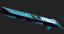
Below is a screen grab from within Substance Painter putting into practice all I have detailed above:

Only the nose has been painted in this image. The chassis, body and cockpit canopy have all just had basic materials derived from the nose applied to them.
I am quite happy with the direction the paint job is going. It should have more impact than the practice colour scheme and composition. My next job is to add more detail to the nose and then paint the remaindering components.